Overview
For the Divvy Data Challenge, Chicago bike rental company Divvy released data on over 750,000 trips and encouraged "all scientists, designers, and programmers to analyze and present the data in visually compelling ways." This entry in the competition contains a number of analyses and visualizations, organized into sections roughly by content.
A visualization of Divvy rides in timelapse. On Vimeo.
For this project, I used a custom visualization tool written in C++/OpenGL in conjunction with statistical analysis tool R to perform analysis and generate visualizations. The next few sections reveal some insights into Divvy usage pattern across Divvy members and non-members, on weekdays and weekends, and across hours of the day. It's just the tip of the iceberg for a dataset like this. Enjoy!
Stations

Growth of Divvy stations in Chicago.
At launch of the Divvy service, there were 68 stations online with a maximum capacity of 1,352 bikes total. Over the next 6 months, 232 more stations came online, for a total of 300 stations and capacity of 5040 bikes. (Note of course that the number of bikes in circulation will necessarily be less than this; if every station were fully stocked, people would have a difficult time dropping off their bikes!) The animated GIF to the left shows the expansion of Divvy stations over time.
Which stations are the most utilized?
A first-pass answer is to look at the total number of rides that have started or stopped at each station, normalizing for the total number of rides and the amount of time the station has been online. The image to the right visualizes station usage with gold, large circles correspond to high usage and blue, small circles correspond to low usage. [Note that this shows usage for each station relative to other stations.]

Divvy stations colored by relative usage.
The top ten stations, according to this normalized metric, are:
| Station | Normalized Metric | % Members |
| Streeter Dr & Illinois St | 1.00 | 8.7% |
| Millennium Park | 0.80 | 18.9% |
| Lake Shore Dr & Monroe St | 0.70 | 12.1% |
| Clinton St & Washington Blvd | 0.65 | 87.2% |
| Michigan Ave & Oak St | 0.62 | 21.3% |
| Museum Campus | 0.59 | 13.5% |
| Theater on the Lake | 0.56 | 21.8% |
| McClurg Ct & Illinois St | 0.51 | 32.1% |
| Michigan Ave & Lake St | 0.48 | 49.0% |
| Canal St & Madison St | 0.46 | 82.5% |
Of course, most of these stations are located around tourist attractions: Navy Pier, the Mag Mile, and Millenium Park. The two exceptions are Clinton & Washington and Canal & Madison, both of which are located by Union Station. The third column in the table above gives the percentage of rides at any given station which were taken by Divvy members (as opposed to one-time customers), strongly suggesting that those two stations are commuter stations.
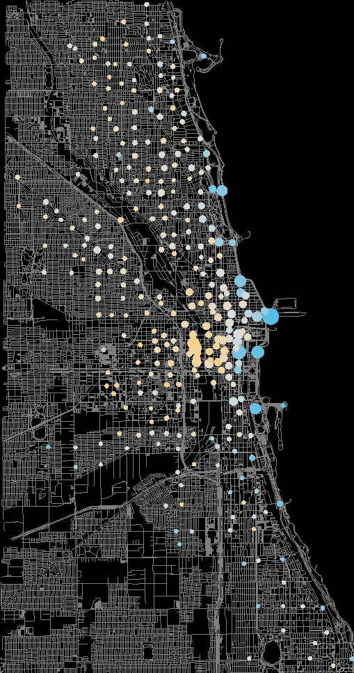
Orange: primarily member.
Blue: primarily non-member.
Size indicates usage rate.
If we visualize Divvy stations by this metric we obtain the image to the left. Orange indicates usage primarily by members, and blue indicates usage primarily by non-members. The size of the circles indicate their relative usage. From this image, it becomes apparent that non-member usage is focused on tourist areas and along the lakefront, whereas stations spread more evenly throughout the city are generally used by subscribers.
Rides
The Divvy dataset contains 759,788 rides between June 27th, 2013 and December 31st, 2013. 53% of these rides were taken by users with a Divvy membership. There are a few ways to break this down that reveal some interesting facts about how people make use of Divvy.
First, take a look at a graph of ridership over time, for members and non-members:
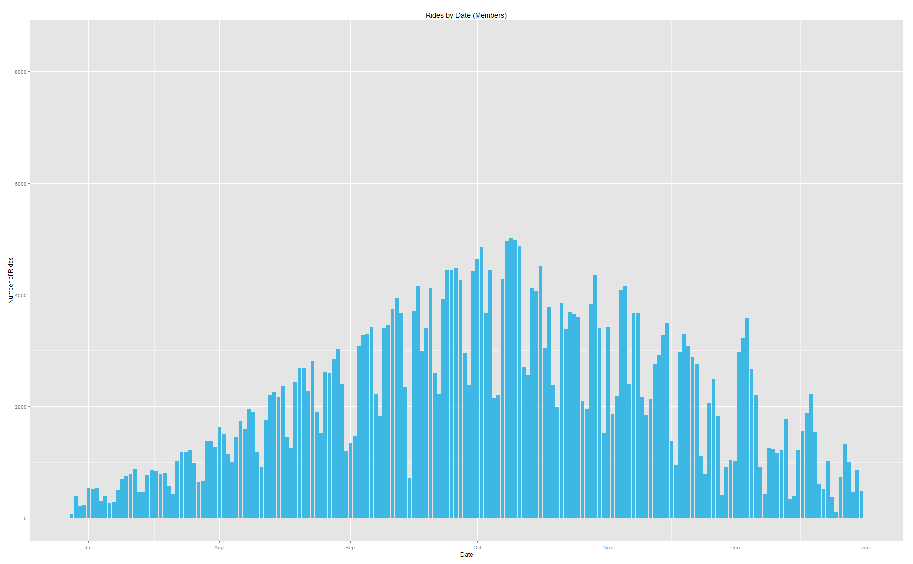
Member ridership by date. Click to enlarge.
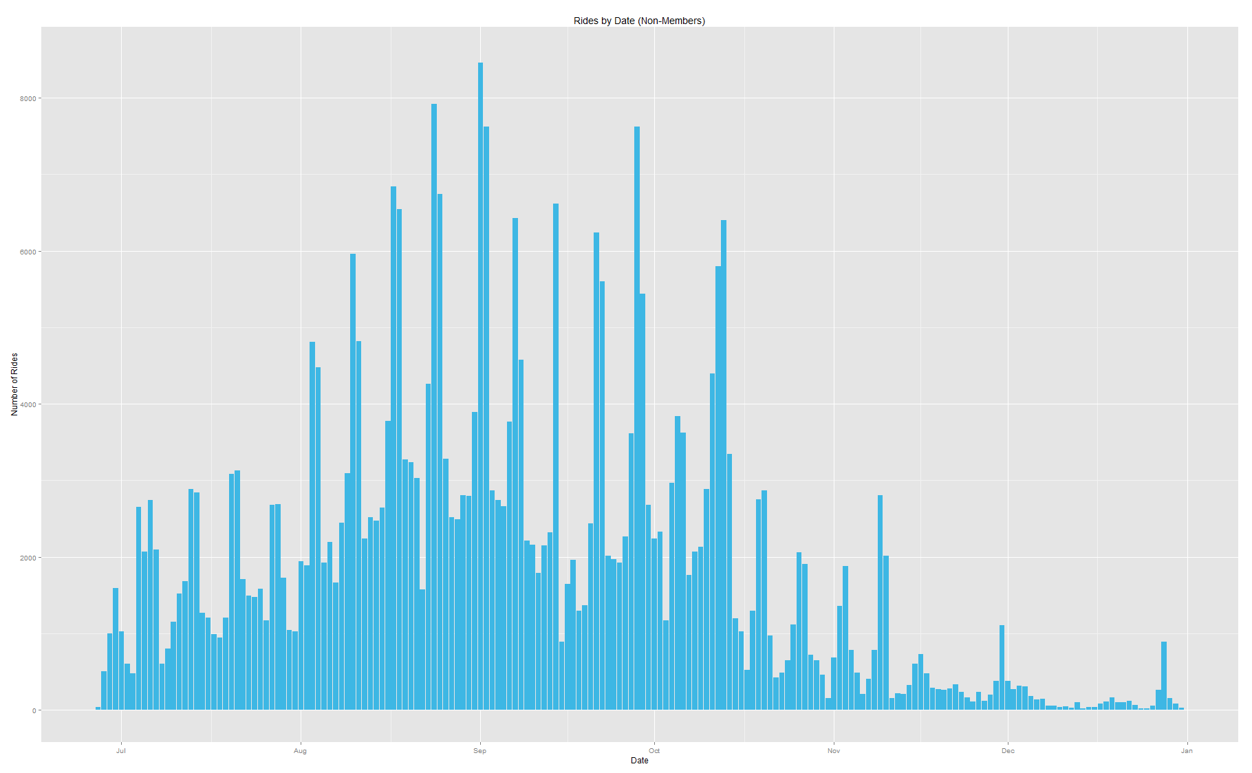
Non-member ridership by date. Click to enlarge.
These graphs tell a couple of stories and hint at a couple more. Rides by members are much more consistent, slowly increasing until October and then steadily tapering off due to the weather. The steady increase is likely a function of steadily increasing membership - that information is not available, but the number of active Divvy stations increased until late October, suggesting a correlation. In contrast, non-member rides are fickle, dropping off quickly as the weather worsens and behaving less predictably throughout. Notable about both graphs is a periodic pattern in ridership that lends the graph its somewhat irregular appearance. Another couple of graphs reveal that members and non-members have very different weekday / weekend schedules:
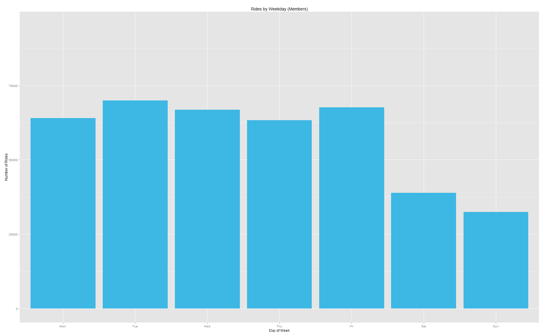
Member ridership by day of week.
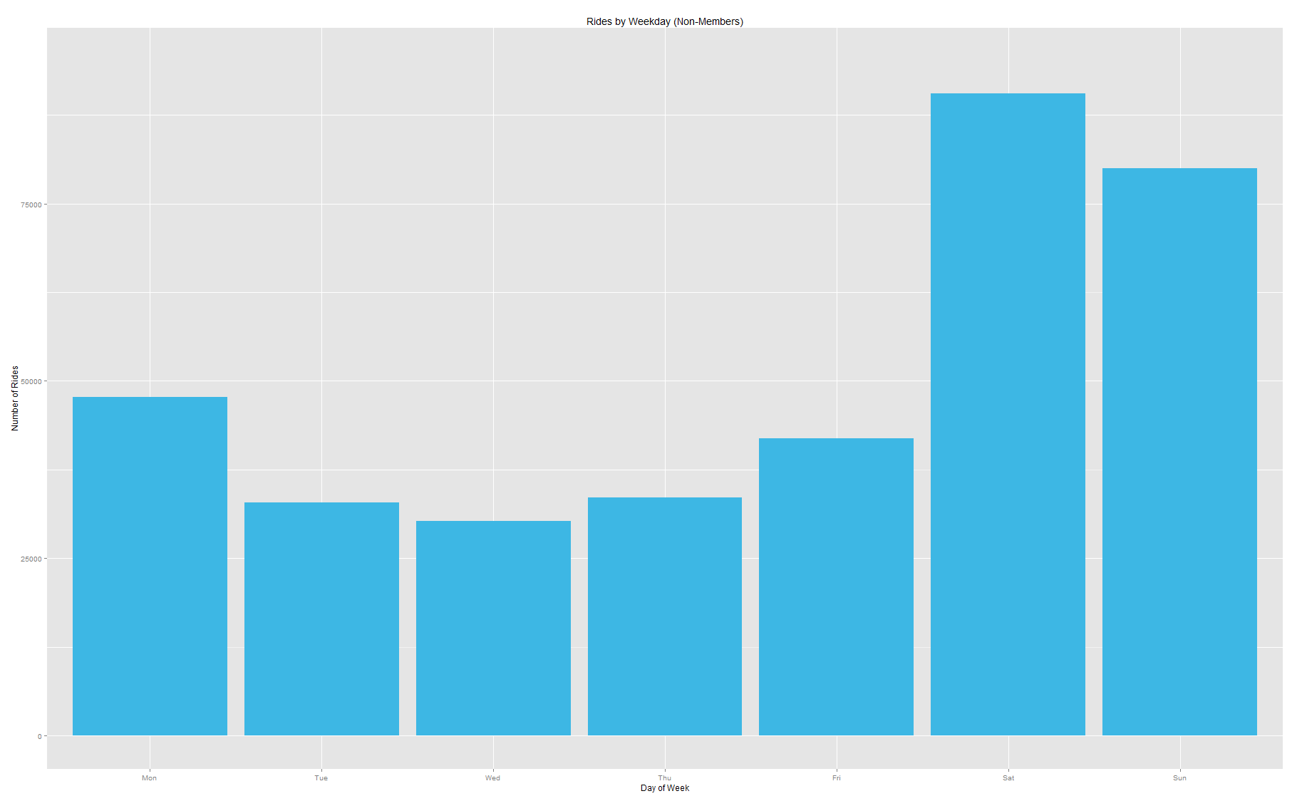
Non-member ridership by day of week.
Members ride their bikes consistently throughout the workweek and non-members log substantially greater activity on the weekends. This further supports the idea that subscribing members of Divvy use the bikes primarily for commuting or running errands, and non-subscribers use the service much more casually. We can take this a step further, too, and examine the distribution of Divvy rides throughout the average day:
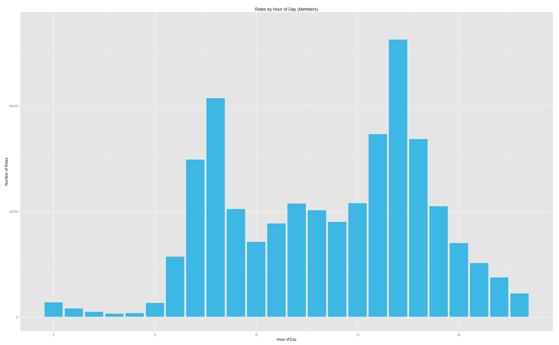
Member ridership by hour of the day.
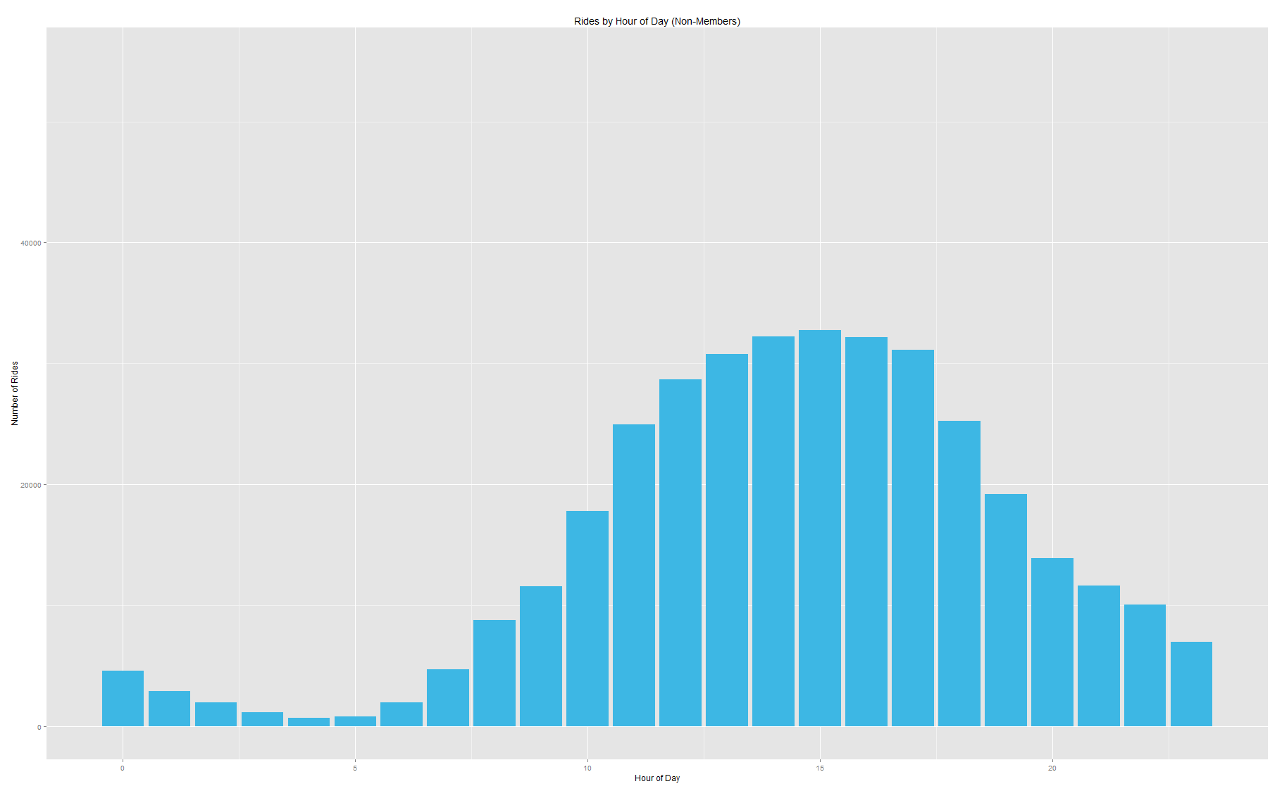
Non-member ridership by hour of the day.
That is some beautiful data. Member usage follows a bimodal distribution clustered around 8am and 5pm, with a fair amount of rides during the day and a small peak around lunch. Non-member usage follows a unimodal distribution which peaks in the mid-afternoon but stays strong into the evening. Both of these plots serve to undermine the distinction between members and non-members primarily as people who use Divvy for work or for play.
Routes
The Divvy dataset includes the stations at which each ride started and stopped, but no information about the path of the bike itself. However, using data from the OpenStreetMap project and the open-source routing tool GraphHopper, we can make some good guesses. (Generally speaking, people will take close to the shortest path between points, and OpenStreetMap data encodes which roads are safe for bikes.)
Members and non-members, unsurprisingly, favor different routes. Ignoring directionality, the top routes for members are:
| Station | Station | # of Rides |
| Michigan Ave & Lake St | Clinton St & Washington Blvd | 1228 |
| Michigan Ave & Washington St | Clinton St & Washington Blvd | 959 |
| Sheffield Ave & Fullerton Ave | Southport Ave & Wrightwood Ave | 786 |
| LaSalle St & Illinois St | Clinton St & Washington Blvd | 782 |
| Clark St & Randolph St | Clinton St & Washington Blvd | 760 |
Clinton & Washington is one of the most popular choices, and is a terminal station in 7 of the top 10 routes for members. The Divvy station is right next to Union Station, which explains its popularity as a commuter station. Sheffield & Fullerton to Southport & Wrightwood is the only oddball route in the list, and is in fact the only route in the top 10 that doesn't start or end in the Loop.
Non-members, of course, have different preferences:
| Station | Station | # of Rides |
| Streeter Dr & Illinois St (Navy Pier) | Lake Shore Dr & Monroe St | 3283 |
| Lake Shore Dr & Monroe St | Museum Campus | 2605 |
| Millennium Park | Museum Campus | 2367 |
| Streeter Dr & Illinois St | Millennium Park | 2332 |
| Streeter Dr & Illinois St | Theater on the Lake | 2001 |
The top five stations for non-members all feature popular tourist destinations as a terminal station. Interestingly, there are only 5 unique stations represented in the top 5 routes. The next five most popular routes only add a single unique station to that mix (Michigan Ave & Oak St) and 9 of the top 10 consumer paths either start or end at Lake Shore & Monroe, Navy Pier, or Museum Campus. And there are no overlaps between the top ten choices for members versus non-members - not routes, not even stations.
Graphs for ride distance and duration are self-explanatory: riders generally prefer shorter rides (median = ~2km, ~13.7min) although there are a good number of lengthier trips on record:
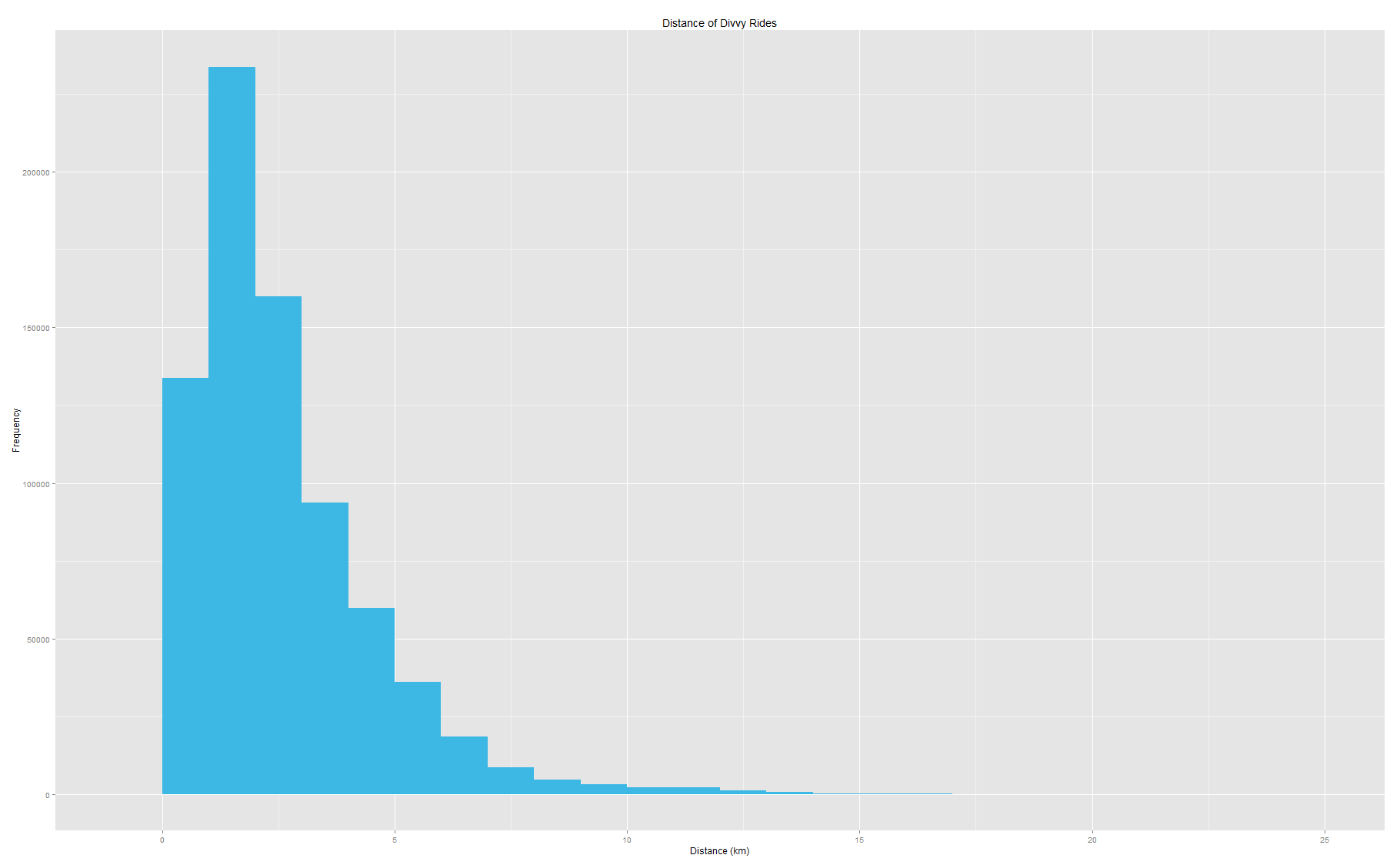
Histogram of Divvy ride lengths.
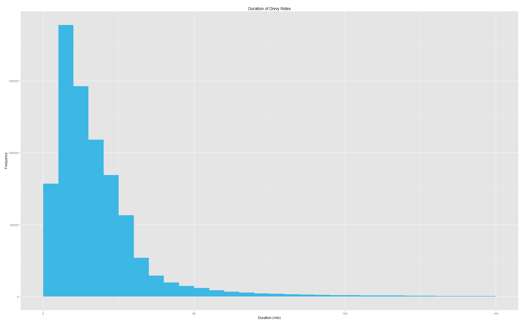
Histogram of Divvy ride durations.
The duration histogram is hiding ~6,000 data points longer than 150 minutes for clarity, approximately 0.8% of the dataset. While 99% of all rides are shorter than 130 minutes long, there are 899 rides listed as lasting 12 hours or longer. That's a lot of overtime.
The distance histogram is hiding something as well. There are 133,834 rides whose length is less than 1km long, but 41,825 of those are actually zero-length. In other words, riders picked their bikes up and dropped them off at the same station. There are a couple of reasons that seem a good explanation for this. One could be that people just like taking joyrides, getting some fresh air and stretching their legs. A more practical explanation might be that people are using Divvy to run errands around town. Divvy markets itself as a point-A-to-point-B system, but a decent number of people are using it to end up right back where they started.
Wrap-Up
I had a lot of fun putting this project together and exploring the results. I spent a lot of my time constructing a toolset from scratch, and would have loved to put more of an emphasis on the visualization of the Divvy dataset. Some of the best observations come from looking at a visualization and saying "huh... is that right?" (For instance, stations in the database are annotated with 'online dates,' but a lot of them are actually in use prior to this date. Not sure what the source of the discrepancy is here, but I would never have known to look for it otherwise.) Fortunately, the tool is readily extensible for future work.
There are a few specific things that I think would be fun to do that didn't get done:
- A WebGL variant of the visualizer. Currently it's a standalone application, but in a compact binary format the dataset is very manageable in memory, and the best way to give someone an understanding of a dataset is to let them play with it.
- Source / sink analysis per-station. Are any stations in danger of running out of bikes? Of being full? How can usage information guide station rebalancing strategies?
- Correlation between usage and historical weather data. There is a huge drop in ridership on September 15th, 2013, noticeable in both of the 'usage by date' graphs above. Historical weather data shows 0.24" of precipitation in Chicago that day. How bad does it have to get for people to stop riding outside?
- A better understanding of commuter routes. Most of them are in the Loop, but what are the other major commuter avenues? Are there any other telling differences between commuter / tourist use cases? Is the distinction strong enough to merit service differentiation?
- A breakdown of statistics by neighborhood. Neighborhood boundaries are freely available online for Chicago. Per-neighborhood use dynamics, demographics, etc. would all be very interesting.
A special thank you to the knowledgable Nisha Srinivas for brainstorming sessions and some welcome assistance with R. And of course, thanks to Divvy for a rich dataset and a fun exercise.
About the Author
 |
Alexandri Zavodny holds a Ph.D. in Computer Science from the University of Notre Dame. His specialties and interests include computer vision, computer graphics, visualization, human-computer interaction, and game development. He is currently living in Chicago and pursuing self-directed projects in the areas of user interfaces and tool-assisted software engineering. He still feels weird talking about himself in the third person. |